


When we first set out to create Tantos, Chef Joe and I knew our flavors had to be incredible, but the packaging also needed to “wow” people at a glance. It wasn’t enough to taste great; we had to look the part. Think about it: in the snack aisle, you’re lucky if a shopper gives your bag one or two seconds of attention. We wanted Tantos to scream, “Pick me up!” while clearly conveying puffed pasta chip goodness and an Italian-American vibe.
Right from the get-go, we had a few non-negotiables for our bag design:
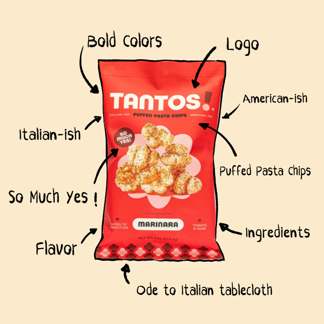
- Stand out on the shelf (in a sea of iconic chip brands).
- Convey an Italian-American flavor (our pasta roots) but in a fun, modern way.
- Instantly show shoppers what Tantos is so they’d be intrigued, not confused.
Oh, and we had one more personal preference: a matte finish. Both Joe and I like that style. Plus, it tends to pop more than standard glossy bags.
We touched on this in a previous post: we hired an external branding agency, BROAD, to help with all our visual elements, including packaging. They showed us three initial design concepts, and we took bits and pieces from each to form one cohesive look. Being part of that process was both exciting and surprisingly detailed, every shade of color, every font style, every icon or pattern had to have a purpose.
Must-Have Design Elements
We started with a few key items that had to appear on the bag:
- Bold colors to catch the eye.
- Flavor indicators (e.g., red for Marinara, green for Pesto) so people connect each color to a flavor.
- Our tagline “So Much Yes,” which captures Tantos’s playful spirit.
- A short blurb about Chef Joe and his mom on the back, paying tribute to her.
- “Puffed pasta chips” displayed front and center under our logo, so nobody misses what we are.
As for our colors, we tested at least six or seven different tones for each main hue. It’s crazy how one shade of red can feel warm and inviting while another can scream “Warning!” But after multiple rounds of feedback, we found the perfect hues for each flavor.
There’s always tension between wanting a clean, modern aesthetic and going full-blast with color and graphics. We wanted to lean bold, these are snack chips, after all, but not so over-the-top that it felt chaotic. Our agency did an amazing job striking that balance. Joe and I ultimately agreed on every design element they presented except for one: whether or not to include a subtle “shell pattern” at the bottom of the bag. Joe loved it; I wasn’t sold. We had multiple conversations debating its place in the design, but he ultimately convinced me. It’s a small detail, yet it ties in our pasta motif nicely.
Beyond the aesthetics, we had to consider the nuts and bolts of bag production. We initially used a stand-up, resealable pouch (during our proof-of-concept stage), but cost-wise and shelf-wise, it wasn’t practical for mass production or the typical chip aisle. We pivoted to a standard chip bag, which aligns better with consumer expectations. Let’s face it: if you’re scanning the chip aisle, a stand-up pouch might look out of place. Sometimes brand synergy means fitting in just enough to be recognizable, while still popping with your own twist.
One of our biggest challenges was making sure new customers instantly understood Tantos was a pasta-based chip. Hence, “Puffed Pasta Chips” got prime real estate at the top front of the bag: bold font, easy to read. We wanted people to think, “Wait, a pasta chip? That’s interesting,” rather than, “I’m not sure what this is.”
Lessons from Designing Our Packaging
Looking back, the design process was about more than just a pretty package. It taught us that packaging is marketing—it’s your first impression, your silent salesperson on the shelf. If people can’t figure out what you’re selling within two seconds, they’ll move on. By combining bright colors, flavorful cues, and our “So Much Yes” personality, we’re betting Tantos stands out just enough to make shoppers grab a bag and discover puffed pasta for themselves.
My advice for anyone tackling packaging design? Be clear about your must-haves vs. nice-to-haves. Don’t be afraid to iterate multiple times, and keep practicality in mind, imagery, bag size, even finishing touches like a matte coating can make or break you. Most of all, remember that your packaging is your brand in physical form. It needs to be something you and your future customers will want to grab and buy.
For Tantos, we think we’ve nailed a look that matches our mission: bringing “Italian heart, American snack soul” to anyone searching for something bold and new in the chip aisle. And if you see our bag next time you’re grocery shopping, I hope you take a chance on puffed pasta chips, you won’t regret it.
