


While we were securing our supply chain, Chef Joe and I realized we needed a compelling, cohesive brand if Tantos was ever going to go national. In my past ventures, I’d never spent real money from day one on branding, maybe I was just naïve or cheap. But with Tantos, I wanted to do it right: create a brand identity that could stand out in the crowded snack aisle, instantly communicate our Italian-pasta heritage, and set us apart from all the “big guys” right from the start.
Before we started, we had three key goals:
- Grab attention in just a second or two, especially when surrounded by iconic chip brands.
- Clearly communicate that Tantos is a pasta-based snack—no head-scratching or confusion.
- Infuse an Italian vibe, reflecting our pasta roots but adapting it into a fun, snackable format.
Just to rewind for a minute about the name: I’ve hinted before how we landed on “Tantos,” but it’s worth repeating because it’s one of my favorite stories. One night, my wife suddenly paused the TV, stood up, and declared, “I got it: Tantos!” She explained how it played off Chef Joe’s pop-up dinner series, Tanto Sí, and also ended in “-os,” like Cheetos, Doritos, and Fritos. Since it was a made-up word, loosely based on the Italian phrase “so much yes,” we knew we could snag the domain name and social handles without a fuss. It was perfect—catchy, short, and reminiscent of established snack brands without outright copying them.
Building a Cohesive Look
Other than wanting to “pop” on the shelf, we didn’t have many preconceived ideas about colors or fonts. We just knew people had to instantly recognize our snack as both Italian-inspired and contemporary. With each flavor. Marinara (red), Pesto (green), Cacio e Pepe (yellow), Classico (blue), we discovered just how many shades of those colors existed and how different tones could make or break the vibe. It was far more intricate than simply choosing “a bright red and a nice green.”
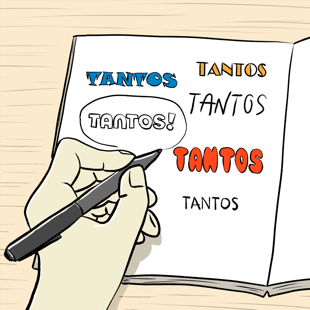
Since we knew “Tantos” would be a text-based logo, the question became: How do we design a wordmark that’s more than just plain text? We focused on finding the perfect font, one that felt approachable, modern, and hinted at Italian roots without screaming “pizza parlor.” Our agency showed us how even the smallest details, like the curve of a letter or the shape of punctuation, can speak volumes about a brand’s personality. That might sound like overkill, but once you see how fonts shape perception, you can’t unsee it.
Ultimately, we wanted people to see Tantos on a shelf or in an online ad and think, “Oh, that looks fun and maybe a bit adventurous.” Our brand pillars centered on phrases like “So Much Yes,” where high-brow meets low-brow (pasta meets chips?), and “comfort wherever you go.” We aimed for a snack that feels familiar (pasta is universally loved) yet daring (puffed pasta chips, what?). In short, Italian heart, American snack soul.
Hire Smart, Then Get Out of the Way
All this happened because we found the right partner. But we knew it wouldn’t be easy. I ended up interviewing at least four or five candidates before deciding. I searched high and low, asked friends for recommendations, and dug around online. Eventually, I was referred to BROAD, an agency that blew me away with their creativity and strategic thinking. They’re the kind of people I’d hire for any future branding project because they changed how I view brand identity. Until Tantos, I’d never hired a full-fledged agency, but now I’m a total convert.
People ask me for tips on building a brand identity. Honestly, my best advice is to hire the right person or agency. I’d love to rattle off deep insights on color theory and typography, but the truth is I leaned heavily on a stellar creative team who knew their stuff. They helped us evolve from a “vague idea” to a “fully realized brand” with a strategic voice, cohesive design, and a logo that pops on a chip bag.
Tantos wouldn’t be what it is without that investment in branding. But seeing the end result on a store shelf (or in someone’s pantry) is so worth it. It’s a reminder that branding isn’t just pretty packaging, it’s the story, the feeling, and the invitation you offer to every potential customer. In our case, it’s also a nod to the Italian-American spirit of turning pasta into a snack.
